Mixed Reality Gaming
Hardware and Platform
Credit: Cliff Miller
castar
CastAR is a pair of AR/MR glasses & gaming console.
https://www.youtube.com/watch?v=hL1qT0TK6aw
The project CastAR started with a rough technical demo being brought onto campus by Rick and Jerry who invented this innovative AR device. With thousands of questions unanswered, the design process of CastAR was long and full of uncertainty. I participated heavily during the product definition, concept prototyping & testing stage. During my 1.5 years working with the team, I helped with :
-
Target User Interview/ UX research
-
Product & Marketing Research
-
Game & Application concept ideation
-
Prototyping with Unity
-
UI/UX design
-
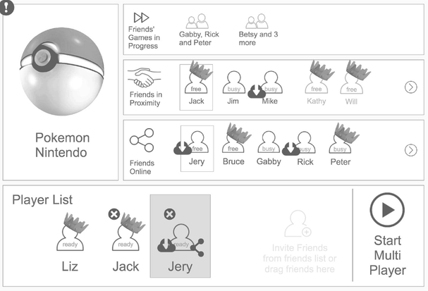
Prototyping of game console menu/navigation system
Many of my research results and design guidelines are still in practice.
Competitor Review
There were a few VR glasses and many similar AR projects at the time, like the Microsoft Hololens and Magic Leap. Some of them had already shipped while some didn't. As a start, I did 5 weeks of research around how these shipped competitors deal with the unique and new UI/UX problems on 3D interfaces.
This research included 4 parts: How do they look, what are users' reviews and comments, how do they suggest their developers to design the product UI in their developer guidelines and what are the take-aways for CastAR.
Three sets of examples:


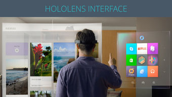

screenshots from my original competitor research report
Some of the questions and takeaways from the research:
-
How is the UI in 3D environments for current products designed and what is the user feedback like?
Most current VR interfaces are just a 2D screen in a 3D world. For many users, it does not meet their expectations.
As the comment goes, “we’ve got 360*360 degree viewing space, yet they only display 3 or 4 titles at a time?” People are influenced by science movies and have many imaginations about holograms and 3D interfaces nowadays. If we can’t design 3D interfaces as fancy as they do in movies, we can’t just put a virtual 2D screen into the 3D world and present everything the same way as on 2D screens because people hate “old-fashioned and flat” objects.
In the meantime, users want more in-person interaction with the interface like walking up to the menu and manipulating options in virtual reality instead of using tools like laser beams.
2. As we already know, there are many design guidelines and rules for 2D UX and interface design. Are there similar rules for 3D interfaces that are important but we don’t know? What are the mistakes we should avoid and what are the tips from other designers that we can learn from?
I read through the design guideline documents of many VR products and tried to find things we can take away for our own hardware.
For example, in some papers, researchers provided suggestions for the size of an area in the space that people can focus on at a time which is called “the visual cone.” There are also similar theories for the best distances to put visual elements and the way to present 3D objects together with 2D UI content to provide a good visual hierarchy. Some also provided many good tips for designing a 3D GUI. This was all useful information for our design in the following year.
A slideshow I made for the team with some of the takeaways I learned from this research:
slideshow made by me
Literature Review
We went to AWE 2017 and found John Howard’s presentation super relative and provided lots of practical knowledge about mixed reality and MR product design. https://www.youtube.com/watch?v=vOqwuB2ON7g
Some notes I took that were considered helpful for our system:
1- User gaze
Really powerful experiences can be created with minimal action required by the user. The simple fact that we know where the user is looking is a very powerful tool for creating a dynamic experience.
2- Gaze cursor
Gaze cursor is something that actually differentiates from the user gaze because we are starting to prompt the user to take direct action. Can use a moving object or a spotlight as the “reticle.”
3- Spacial sound
The audio really helps you find objects that move outside your field of view. It also makes them physically present in the world.
4- Haptic audio
Audio is a very powerful way to give us a set of the physical sense of objects. “Audio force feedback” reinforces how audio makes virtual objects not just present but tactile and giving these objects organic sounds tells us with the materials they’re made of and so it helps us understand how we’re going to interact with them and what the behavior is going to be right.
Combining this with gaze cursor: How would it sound different as I move my gaze across the rough surface vs a smooth surface. In these experiences when you don’t have hand controllers your eyes become your hands and so giving something a sense of touch just by using audio can be extremely powerful for completing the illusion of “that thing is over there and it’s real.” We can even use this to create a “sixth sense” to warn users of nearby hazards.
5- Context-sensitive actions & controls
Designers coming from a flat UI/UX background are used to anchoring information and control to the edge of the frame and fill in the center of content. But in MR there’s no frame and so figuring out where we anchor this information can be tricky.
Contact menus work really really well but when you have a high density, environments can be really challenging and tricky. Some solutions work in every circumstance some of them have to be tuned or reconsidered for different types of circumstances.
6- Extended desktop
There was a lot of resistance to adopting new tools that didn’t take into account their existing workflows. If we can build tools that we can take the best things about virtual reality and mixed reality and we can show how they integrate into existing toolchains, workflows, and processes. Users are going to be more willing to adopt those tools and processes. Mouses and touch screens are incredibly valuable tools since users are very familiar with them. There are circumstances where these tools may not work since we are trying to create immersive entertainment. But for many productivity applications, they are still incredibly valuable. Whatever is most useful that immediate situation or most comfortable for that individual user is what matters the most. This can be incredibly important for trying to get users who are either resistant or uncomfortable with new technology but very familiar with the technology they have to sort of dip their toe in the pool of these new systems of virtual reality and mixed reality.
Some other notes taken from studying some papers that included mix-reality environment UX design suggestions:
( Sources:
Furmanski, Chris & Azuma, Ronald & Daily, Mike. (2002). Augmented-reality visualizations guided by cognition: Perceptual heuristics for combining visible and obscured information. Proceedings - International Symposium on Mixed and Augmented Reality, ISMAR 2002.10.1109/ISMAR.2002.1115091.
M. A. Livingston et al., "Resolving multiple occluded layers in augmented reality," The Second IEEE and ACM International Symposium on Mixed and Augmented Reality, 2003. Proceedings., Tokyo, Japan, 2003, pp. 56-65, doi: 10.1109/ISMAR.2003.1240688.
J. P. Rolland, C. Meyer, K. Arthur and E. Rinalducci, "Method of Adjustments versus Method of Constant Stimuli in the Quantification of Accuracy and Precision of Rendered Depth in Head-Mounted Displays," in Presence, vol. 11, no. 6, pp. 610-625, Dec. 2002, doi: 10.1162/105474602321050730. )
1 - User's performance decreased with AR manual tasks, but were able to adapt to the sensory rearrangement quickly.
2 - Users will perform better with the AR interface as opposed to the immersive collaborative environment; users communicated almost the same as in face-to-face collaboration presence of a real surface near a virtual object significantly increase depth-perception.
3 - Adding a virtual background with texture reduced depth perception errors.
4 - Upper bound for discrimination threshold is 7mm-8mm.
5 - Visual cues for discriminating overlapping objects: graphic style wire+filling>filling only>wire only, filling opacity and color intensity decreases as the object goes further.
6 - Perspective effects of the ground plane rising to meet the horizon and apparent object size are strong depth cues. So (1), if possible, always put a ground plane (2), a backboard must be available for users as one of the default options for the horizon visibility.
7 - Shadows of virtual objects provide a stronger connection between the real world and virtual objects and provide important depth cues.
8- Major determining factors in text legibility are overlaps and motion.

screenshot from youtube.com
Conclusion: Design Guidelines
How to design a 3D user interface in a mixed-reality environment?
With the takeaways from competitor reviews, attending conferences, and the literature review, I drafted the original design guideline document for our design team as well as the future developers of CastAR. As a console-specific application development documents, these suggestions were super helpful for the team throughout the R&D process at the time because 3D interface & UX design were a brand new topic and there were very few references or guidelines to follow. Most of them are still contributing to later versions of designs after my involvement.
Size and Placements
1- A coupled zone is more applicable than the 1-5m distance in VR settings. Be selective when using the decoupled zone for "wow" moments.
2- Make use of the game board plane for grounding some UI elements. Aligning a scene to the physical tabletop creates a better “pop-up” effect. If things are below the surface of the board, users feel as if they are looking into a window or a portal.
3- A 0° viewing angle isn’t recommended for extended periods. This can occur easily during browsing sessions, but it serves as a designated place for gestures and short interactions.
4- To prevent clipping near the borders (which breaks the visual illusion), display more important content toward the center and less important content toward the edges.
5- Major UI controls should be immediately visible - don't require users to move to see them.
6- Avoid locking anything to the camera.
Interaction
1- A scene that works for a sitting user doesn’t necessarily work for a standing one. We really have to consider responsive design during the layout of a scene.
2- When creating interactive elements, targets should be no smaller than 3 degrees - measured in degrees to support a responsive design paradigm. The minimum size for any viewable object should be more than 7mm.
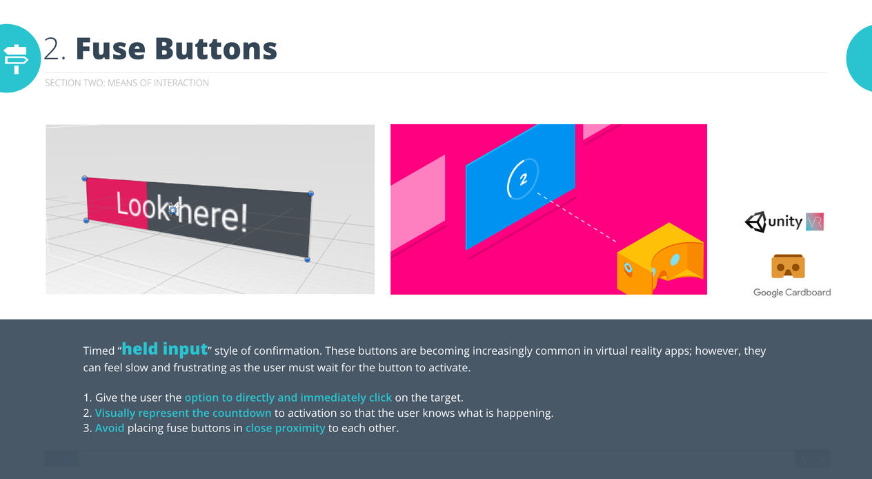
3- The simple fact that we know where the user is looking is a very powerful tool for creating a dynamic experience. The user’s gaze can be used to create really powerful experiences because it requires little action by the user. However, due to the limitation of the game board (which limits FOV), a fuse button and gaze cursor are not recommended for fast and accurate interactions (like typing).
4- Use spatial and haptic audio feedback to help users locate and interact with objects. Use the combination of gaze cursor and haptic audio to create a sense of touch.
5- An infinite (and adjusting) laser beam is most suitable for utilizing the depth of the castAR game board.
6- A fixed-length stylus beam may be useful for above-tabletop interactions. A shorter stylus beam can make interactions with 3D objects feel more direct.
7- Display a reticle when using the gaze cursor or infinite laser beam for better targeting. The form of the reticle can be a 2D icon, a physical object, or a spotlight.
8- Provide immediate feedback when a user initiates an action (<0.1s). If necessary, give an indication of how long the action will take to complete. Warn users if actions could have negative consequences.
Spatial UI vs. Diegetic UI
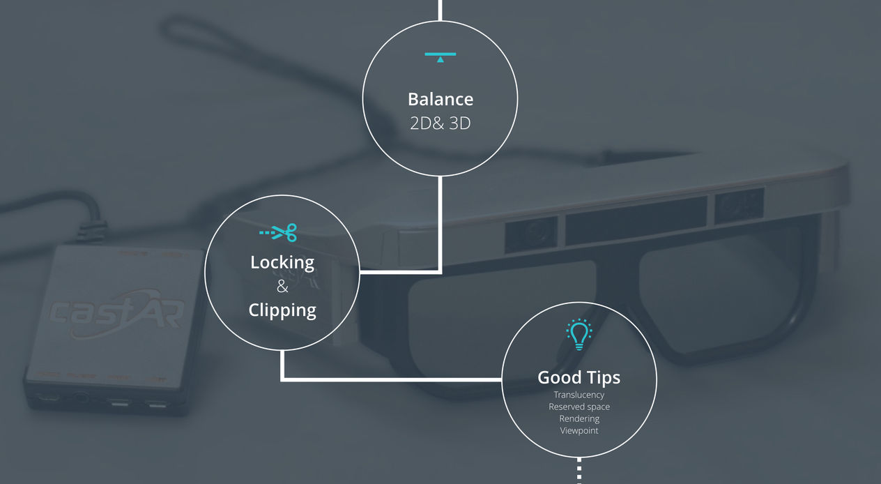
1- The ratio of 3D and 2D content should be well-balanced and follow good design practices.
2- Use diegetic UI (contact menus) to emphasize the relationship between a UI element and a 3D object. Keep in mind it won’t work if you have a high density environment.
3- 3D scenes get busy fast. The overuse of colors and objects that aren’t grounded or aligned contributes to this.
4- To prevent interference between 2D UI and 3D content, make use of translucency, reserved space, moving viewpoints, and switching rendering modes.
Scene Content
1- If avoidable, do not make 2D content since it breaks the illusion.
2- If rapid changes of objects or scenes are required, match the depth from one scene to the next to avoid eye-jumping.
3- Perspective effects of the ground plane rising to meet the horizon and apparent object size are strong depth cues. So (1), if possible, always put a ground plane; (2), Backboard must be available for users as one of the default options. If possible, always add a background or other reference objects with a texture/grid in the scene.
4- If possible, virtual objects should match the real-world scale and UI elements can match users’ familiar metaphors.
5- Black looks transparent, while white will be very bright. Cool colors feel like they recede and warm colors jump to the foreground.
6- Major determining factors in text legibility are overlaps and motion. Avoid designing overlapping and moving texts.
7- Use a vignette, highlighted wireframes, and negative shadow techniques to highlight objects.
Focus Group Study
A big part of our early-stage research was the focus group. The target group of CastAR was children and teenagers aged between 8-16 (although the product is designed for all ages). We invited many kids to the office and conducted several rounds of research. Our methodology included a questionnaire survey, group discussion, focus group interviews and one-one interviews.
1- Questionnaire
We designed multiple rounds of research to study our focus group and build our persona.
In the first round, we asked some basic questions like “What kind of games do you usually play ”, “when and where do you play with your game consoles” and ” whom do you play with” to learn some basic knowledge of our target users’ gaming habits.


screenshots from our research report, questionnaire designed together with Gabrielle and Esther, report made by me.
2- One-one interview
We got the kids into the office and talked with them in person (accompanied by their guardians.) We had them play with the demos and asked them about their gaming habits and impression of the product concept sketches.

photograph by me
Interview question preps:
-
Personal basics:
Name, age, job/grade, major (or areas of interests),
place of origin, family members,
living situation, financial situation
(pull out the survey prior to the interview to avoid overlapping questions)
-
Tell us about one of your typical days
“Game” aspects not necessarily have to be covered yet
Don’t have to be accurate
An example: Get up at 7, grab a sandwich mom made, take a bus to school at 7:30, lunch break at 12, go home at 4, dinner at 6, homework from 7-9, go to bed at 10.
-
Gen Z and Gen X
Who are the people you interact with the most on your phone? Which app?
Talk about the major “things” you use for social (not necessarily mobile apps)
Do you use the same method to interact with friends, family, and strangers? Would you switch at some point?
Tell us some examples of “social on the go” and some examples of how you and a friend collaborate in a game. Which kind of society do you prefer? (Which means of interaction is more beneficial for friendship?)
What are your parents’ favorite games and movie characters?
What’s your family’s favorite game? Other activity? Why do you like them?
How often do your parents evaluate and buy new games/game consoles?
-
About Game Play
When do you play? (Covered in the survey, may ask around it) On the bus? During lunch? Between classes? After dinner? Before bed?
What games do you play (recently) and what game console do you play with (also covered in the survey) And Why?
Tell us about a game/game console you enjoyed playing but gave up.
One story of a board game play (who, what, when, how)
Whom do you play with?
If it’s friends and family, do you meet them regularly to play?
If it’s strangers, how do you meet/match/make friends and how often do you play with the same stranger?
What’s the percentage of playing with strangers among all the multi-player games?
One story of playing digital games with family/friends recently (proximately? Remotely? Downloaded?)
-
Game and Game Console Purchasing
Did you ever spend money on games or a game console?
What’s your most recent purchase? Why?
What do you think will be your next major purchase?
What’s the purchase of the biggest amount? Why?
Whom do you know purchased any expensive game console? What do you think about his/her purchase? (like whether you think it’s a good deal/ good choice/ jealous/ ...)
What percentage of your spendable money do you want to spend on a game console?
Would you ask your parents to buy a game console for you?
-
Game Genre and Art Style
Play Minecraft? Snapchat? Do you think they are visually appealing?
What games do your close friends play and how do you like them? Visually?
Examples of a few games that you think are fun but ugly (that you are tolerating while playing)
Examples of games that are beautiful but you are not playing (for any reason)
Mobile apps and websites that you think are appealing to you
-
Demo and Feedback
What do you think about the hardware: Comfortable? Weird looking? Space consuming?
What do you expect to see and play with this hardware? (Can be art style, game genre, or more specific description)
How much do you think it would cost? If you heard that your best friend has one and ask you to take your set over to play together, how much do you want to spend?
If you have one for free, what do you want to see as the first scene greeting you every day?
What art style (the ones we talked about before) do you think would fit well into this game console?

photograph by me

whiteboard notes from our target group discussion, handwriting by Esther
3- Group Discussion
On the next round, we conducted a few group discussion sessions with the kids. They were very excited and expressed lots of valuable imagination to the future of the product which had been incredibly inspiring. We also made some art style samples/ hardware samples and UI samples for them and let them vote for their preferred ones.


photograph by me
We learned a lot from the research. Examples include:
1- Gamer camp has a strong aversion to paying in order to win. If CastAR hopes to make freemium games that appeal to this camp, we’ll need to be very careful that our free content isn’t so shallow as to isolate this camp of players.
2- A casual gamer camp could be inclined to using our system for its tangibles and game board, as they are similar to card games and board games respectively.
3- All participants gravitate toward higher quality, but simpler artwork and brighter colors. Cartoony styles were perceived as “young,” while quirky or unique styles were not necessarily.
brainstorming
and sketching
Hand Sketching & Dirty Mockups
In the process of brainstorming, I produced lots of fun sketches and mock-ups. Because some of the 3D ideas & interactions are hard to sketch out in 2D, I tried a variety of different materials and tools to convey my concepts.
Although I was very aware that it’s not practical and not necessary to design CastAR products in fully cartoony and 3D style, it would still be helpful to brainstorm cute design concepts as a start. The really impressive design has the potential to be simplified and converted into a practical design.
Some of the ideas I worked on included:
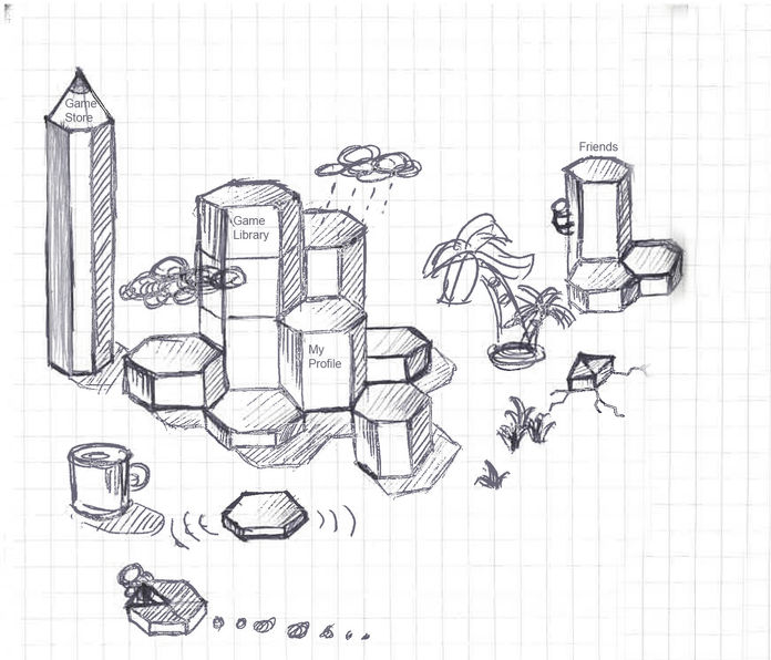
1- Game console operating system concepts, e.g. fun ways to present game launching in 3D for kids.
2- Explored ways to design regular content interactions like “menu” and “browsing lists” in 3D that are not only pop-up and fun but also easy to understand.
3- Basic interaction elements that could work with the hardware (a physical “wand” shaped device) in 3D board game settings. Examples include discovering how “make selection” and “dismiss notification” behaviors would look like.
hand sketch by me


stop motion gifs made by me
DEMOS AND
TESTINGS
Based on some of my sketches and design guidelines from previous research, we built lots of demos with tools like Unity (3D concepts and scenes) and Axure (2D info structure and interactive UI demos.)


logic flow proposals made by me
some of the 2D and 3D quick demos made by me
The first hi-fi demo we made for testing purposes was called the “July demo,” which was made and presented at AWE for the crowd and potential investors. It was designed to highlight the pop-up visual effects of a lightweight mixed-reality headset.
![video[00-00-04--00-00-14].gif](https://static.wixstatic.com/media/27e820_eb380e2d744747c7ac8d0740a5d2123c~mv2.gif)

left: 3D interactive demos made by me using Unity
right: photograph of me and Gabrielle testing the demo with target users we recruited

one of the 3D scenes of the July demo, artwork by Cliff Mueller
What we learned from the July demo
-
A scene that works for a sitting user doesn’t necessarily work for a standing one. We really have to consider responsive design during the layout of a scene.
-
3D scenes get busy fast. The overuse of colors and objects that aren’t grounded or aligned contributes to this.
-
Aligning a scene to the physical tabletop creates a better “pop-up” effect. If things are below the surface of the board, users feel more as if they are looking into a window or a portal.
-
Avoid placing objects too close to the edge of the board, as clipping breaks the illusion.
-
Interactions and component behaviors need to be cohesive and defined early on. Design and art need to come together and flush out a solid concept before moving forward.
During my involvement in the project, we made 2-3 versions of demos and prototypes. Among which a perfect use case for CastAR hardware was the ATC demo (air traffic control) in which aircraft dispatchers could see the positions and routes of aircrafts in 3D which would decrease the likelihood of making a mistake. We consider this the most valuable use case to showcase aside from gaming in which I spent 3-5 months working on.
The project was almost finished and ready to launch by the end of 2018 when the package design was done. Unfortunately it was suspended for funding reasons and I was reassigned to other projects as a result. The inventors of CastAR are still trying to relaunch the project up and many of our valuable contributions will hopefully come to light in the near future.


