The new Essential phone R&D
After the first generation of Essential Phone was released, I participated in the second generation (the new Essential Phone) R&D process. My work mostly focused on the camera system and its companion app.
Project length: 3 months.
Competitive Review
Team size: Individual work.
Regarding 10 potential features, we were going to build for the second-generation Essential phone, a few popular phones (at the time) were picked, studied, and compared horizontally. A competitor review was presented to the team which has been super helpful throughout the design process. The following slides come from a portion of the research work I did.
Initial UX Proposal
Team size: Individual work with small team discussion.
For each feature listed, multiple UX design solutions were created and presented to the team. The new UX design had to be unique because the updated touch screen and camera technologies were integrated into the new generation. At the same time, it still needed to be easy to use and respect users' habits. It was not easy making decisions between ideas so multiple rounds of small team discussions helped me filter and iterate them.
The slides below present the early stage of the UX design process for one of the features I focused on.
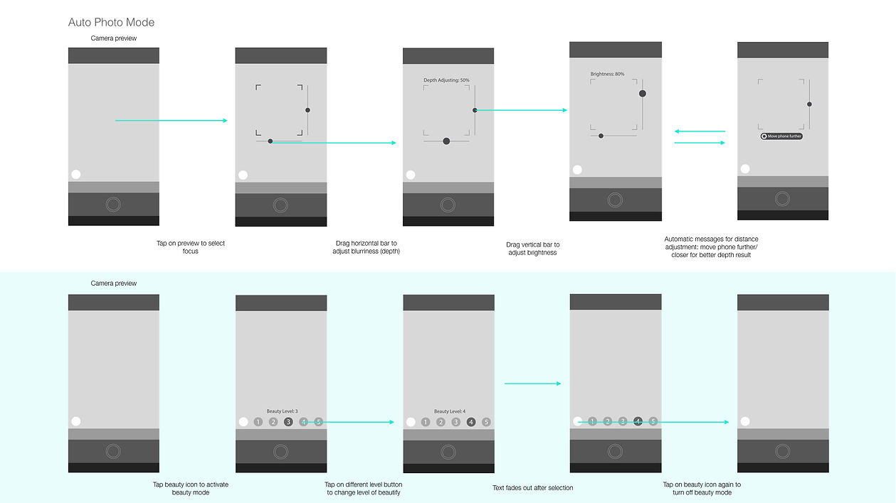
As an example, during the R&D process of the portrait mode feature, I proposed a few UX design patterns that are unique to the second generation of Essential. The portrait mode automatically identifies faces and portraits. Then it would apply effects like background blurriness to the portraits so they would look more vivid.
1. As the beauty mode feature got increasingly popular among Android phones (especially the most popular phones in Asia), I suggested integrating this as a parallel feature with portrait control. In the interface, the "beautify level adjustment" button toggles on and off for users to select the level of "magical auto adjustment."
2. More precise adjustment options are also available while tapping on the screen to focus with which users can further adjust the brightness and blurriness of the portrait. Horizontal and vertical bars appear when the camera is focused. Horizontal and vertical dragging anywhere within the camera view triggers the adjustments which provide easier interaction.
3. Camera AI turns off autoportrait adjustments when no obvious faces (or subjects that need to be highlighted) are identified. Users will see gentle notes with suggestions like "move the camera farther" or "move the phone closer" for the better focus to turn portrait mode on. These notes will not show up in other camera modes.
Final User Flow
Team size: Individual work with small team discussion.
After several rounds of iteration, higher-quality user flow charts were made for further development.
Another example of Pano Mode higher fidelity prototype:
Interactive Prototype
Several interactive prototype pieces were made to help test our design hypothesis. The tool I used for this project was Principle.
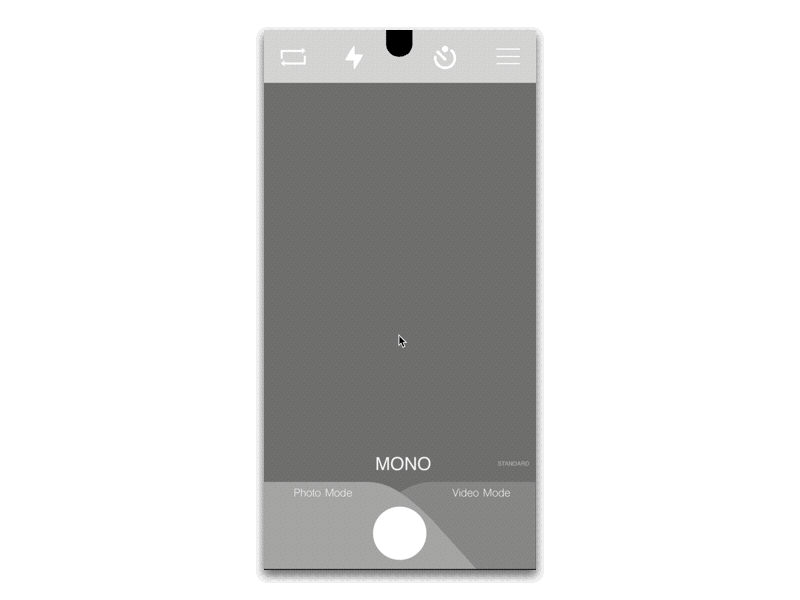
One of the UX designs focuses on reducing confusion between photo mode and video mode. The pull-up camera roll window provides faster access to reviewing new photos.
Second-level features within each camera mode (portrait, pano, etc.) were moved to the upper part of the screen and were horizontally scrollable.
Different from the first design (shown on left), the pull-up window was converted into a pull-down window and the horizontal scroll bar was moved down to the lower part of the screen.
After testing the first version with the team, we found it easier to swipe horizontally on the lower part of the screen while vertical swiping is usually not affected when located farther away.